


Rare Old Map of US Tornado Activity 1930-1974 by Fujita & Pearson: Paths, Death Statistics, Tornado Alley
20% off 2 — 33% off 3
Add any two eligible items to your bag to receive 20% off. Add a third and it will be complimentary (equivalent to 33% off when purchasing three).
No code needed — the offer applies automatically at checkout.
Valid on all standard maps and fine art prints. You can mix and match any designs.
If you’d like to ship items to multiple addresses, please contact us before placing your order.
Custom and bespoke commissions are excluded.
Contact us if you have any questions
 Designed in London Made in the USA
Designed in London • Made in the USA
Designed in London Made in the USA
Designed in London • Made in the USA

Restored from the original 1974 map and printed to museum-grade archival standards. Read the full description below.
Choose your size
Choose your finish


(More info)
Gift message & custom finish

If you want to add a gift message, or a finish (jigsaw, aluminium board, etc.) that is not available here, please request it in the "order note" when you check out.
Every order is custom made, so if you need the size adjusted slightly, or printed on an unusual material, just let us know. We've done thousands of custom orders over the years, so there's (almost) nothing we can't manage.
You can also contact us before you order, if you prefer!

- Made locally for fast, safe delivery
- No import duty or hidden fees
- Need advice? Call us or message on WhatsApp
Own a piece of history
8,000+ five-star reviews


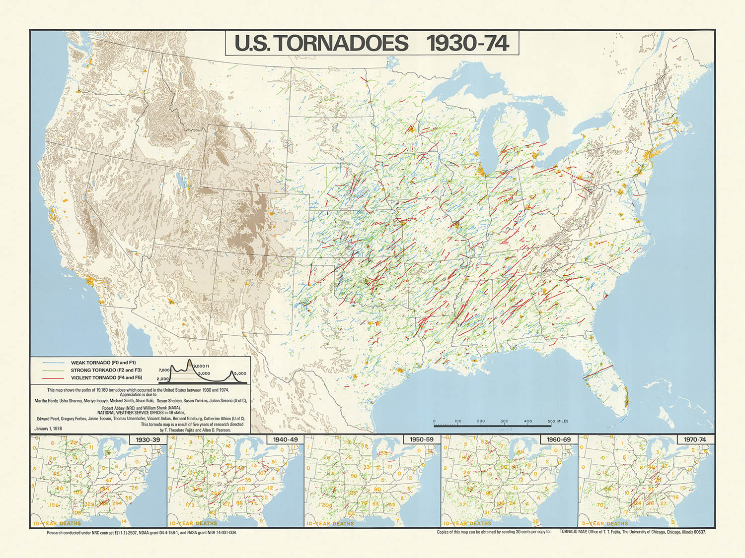
This remarkable thematic map, titled "U.S. tornadoes, 1930-74," offers a visually arresting chronicle of nearly half a century of tornado activity across...
Read the full product descriptionThis remarkable thematic map, titled "U.S. tornadoes, 1930-74," offers a visually arresting chronicle of nearly half a century of tornado activity across the contiguous United States. Created in 1974 by the eminent meteorologists T. Theodore Fujita and Allen D. Pearson, the map presents the paths of 19,189 tornadoes, weaving a dense and intricate tapestry of meteorological history. The main focus is the frequency, distribution, and human impact of tornadoes, making this map not only a cartographic achievement but also a profound statement on the intersection of natural forces and human lives.
At the heart of this map lies a masterful use of infographic techniques. Each tornado path is meticulously traced, resulting in a dramatic concentration of lines that immediately draws the eye to the infamous "Tornado Alley" of the central United States. The map’s design elegantly balances clarity and density, using subtle background features such as state boundaries, major rivers, and the Great Lakes to provide orientation without distracting from the central data. This approach reflects the best traditions of 1970s scientific cartography, where function and form are harmoniously intertwined.
What truly elevates this map is its integration of statistical insets, which chart tornado-related fatalities by decade from 1930 through 1974. These five inset maps provide a sobering counterpoint to the swirling tornado paths, contextualizing the human cost of these natural disasters. The inclusion of these infographics transforms the map from a mere record of meteorological events into a nuanced exploration of risk, resilience, and the evolution of public safety in the face of nature’s unpredictability.
The map’s creators, T. Theodore Fujita and Allen D. Pearson, are legendary figures in the field of severe weather research. Fujita, in particular, is renowned for developing the Fujita scale, which remains a foundational tool for assessing tornado intensity. Their collaboration on this map not only lends it scientific authority but also marks a pivotal moment in the history of meteorology, as researchers began to harness visual data to communicate complex patterns and drive public understanding.
Beyond its immediate scientific value, this map stands as a cultural and historical artifact. It captures a period of transformation in American meteorology, when advances in data collection and analysis began to yield new insights into the patterns of extreme weather. For collectors, historians, and weather enthusiasts alike, this map offers both a snapshot of a defining era and a testament to the enduring power of cartography to illuminate the forces that shape our world.
Places on this map
- United States of America (contiguous 48 states)
- Texas
- Oklahoma
- Kansas
- Nebraska
- Iowa
- Missouri
- Arkansas
- Illinois
- Indiana
- Ohio
- Mississippi River
- Great Lakes (Lake Superior, Lake Michigan, Lake Huron, Lake Erie, Lake Ontario)
- Appalachian Mountains
- Southeastern states (e.g., Alabama, Mississippi, Georgia, Tennessee)
- Central Plains region (Tornado Alley)
- Western United States (less tornado activity)
- Northeastern United States (less tornado activity)
- State boundaries (all contiguous U.S. states)
- U.S. regional divisions (Midwest, South, Plains, Southeast)
- Borders with Canada and Mexico
- Gulf of Mexico (southern boundary)
- Atlantic Ocean (eastern boundary)
- Pacific Ocean (western boundary, though not the focus)
- Inset maps showing the entire U.S. for death statistics by decade
Notable Features & Landmarks
- Dense clusters of tornado paths, especially in the central United States (Tornado Alley)
- Clearly marked tornado paths, each representing an individual tornado event
- Five inset maps, each depicting tornado-related deaths by decade (1930-39, 1940-49, 1950-59, 1960-69, 1970-74)
- Major rivers, such as the Mississippi River, are depicted to aid geographic orientation
- The Great Lakes are shown as major water bodies
- The Appalachian Mountains are visible, acting as a geographic reference
- The map legend explains the symbols and lines used for tornado paths and death statistics
- The map title and credits to T. Theodore Fujita and Allen D. Pearson are prominently displayed
- The highest density of tornado paths appears in states like Texas, Oklahoma, Kansas, Nebraska, and Iowa
- Lower density of tornado paths in the western and northeastern United States
- The southeastern U.S. also shows a notable number of tornado paths
- The inset maps use shading or dots to show the number of tornado-related deaths per state or region
- The map uses contrasting colors or line weights to distinguish tornado paths from other features
- The overall design is data-dense, emphasizing the frequency and distribution of tornadoes
- The map includes a scale bar for reference
- Tornado paths sometimes cross state lines, illustrating the wide-ranging nature of some tornadoes
- The map is oriented with north at the top, following standard cartographic conventions
Historical and design context
- Name of the map: U.S. tornadoes, 1930-74
- Created by T. Theodore Fujita and Allen D. Pearson in 1974
- Thematic infographic map, focusing on tornado occurrences in the United States
- Visualizes the paths of 19,189 tornadoes that occurred in the U.S. between 1930 and 1974
- Includes insets showing tornado-related deaths for five different decades: 1930-39, 1940-49, 1950-59, 1960-69, and 1970-74
- Scale of the map is approximately 1:6,000,000
- Mapmakers: T. Theodore Fujita, a pioneering meteorologist known for developing the Fujita scale (F-scale) for tornado intensity, and Allen D. Pearson, a notable figure in severe weather research
- Published in 1974, shortly after the devastating 1974 Super Outbreak, one of the largest tornado outbreaks in U.S. history
- The map is a product of a period when tornado documentation and research were becoming more systematic, with increased use of meteorological data
- Provides a unique visual summary of over four decades of tornado activity, emphasizing the frequency and distribution of tornado paths
- Thematically, the map addresses natural hazards, specifically tornadoes, and their impact on human life
- The inset maps give valuable historical context on the changing patterns of tornado-related fatalities over time
- The map likely served as a research tool and public awareness resource during a time of increasing interest in disaster preparedness
- The design uses dense, overlapping lines to represent tornado paths, visually conveying the concentration of tornado activity in certain regions
- Highlights the "Tornado Alley" region in the central U.S., known for its high frequency of tornadoes
- Reflects the state of meteorological science and data collection in the mid-20th century
- The map's creation reflects a growing collaboration between meteorologists and cartographers for public communication
- Historical significance: represents one of the earliest comprehensive visualizations of tornado data in the U.S.
- The data period (1930-1974) includes significant technological and methodological advances in weather observation
- The map provides a baseline for comparing tornado activity before and after the implementation of modern warning systems
- It serves as a historical document, showing the evolution of both tornado research and public safety efforts
- The map would have contributed to public understanding of tornado risks and influenced policy and building codes in tornado-prone areas
- The map's style is characteristic of 1970s infographics, with a focus on clarity and dense data visualization
- The inclusion of death statistics contextualizes the human cost of tornadoes, not just their frequency
- The map is an early example of thematic mapping in meteorology, preceding the widespread adoption of GIS
- The map's publication by leading tornado researchers gives it additional scientific credibility
- The infographic approach makes complex meteorological data accessible to a wider audience
- The map's focus on the U.S. reflects the country's unique vulnerability to tornadoes due to geography and climate
- The map does not include Alaska, Hawaii, or U.S. territories, focusing solely on the contiguous states
Please double check the images to make sure that a specific town or place is shown on this map. You can also get in touch and ask us to check the map for you.
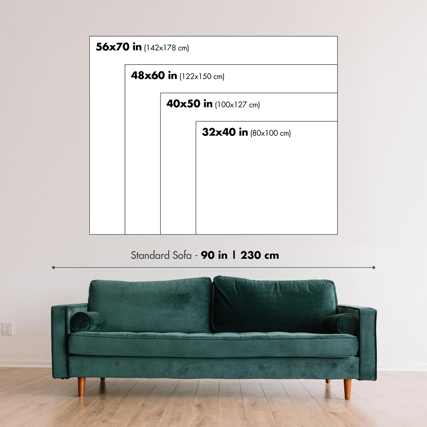
This map looks great at every size, but I always recommend going for a larger size if you have space. That way you can easily make out all of the details.
This map looks amazing at sizes all the way up to 90in (230cm). If you are looking for a larger map, please get in touch.
The model in the listing images is holding the 18x24in (45x60cm) version of this map.
The fifth listing image shows an example of my map personalisation service.
If you’re looking for something slightly different, check out my collection of the best old maps to see if something else catches your eye.
Please contact me to check if a certain location, landmark or feature is shown on this map.
This would make a wonderful birthday, Christmas, Father's Day, work leaving, anniversary or housewarming gift for someone from the areas covered by this map.
This map is available as a giclée print on acid free archival matte paper, or you can buy it framed. The frame is a nice, simple black frame that suits most aesthetics. Please get in touch if you'd like a different frame colour or material. My frames are glazed with super-clear museum-grade acrylic (perspex/acrylite), which is significantly less reflective than glass, safer, and will always arrive in perfect condition.
This map is also available as a float framed canvas, sometimes known as a shadow gap framed canvas or canvas floater. The map is printed on artist's cotton canvas and then stretched over a handmade box frame. We then "float" the canvas inside a wooden frame, which is available in a range of colours (black, dark brown, oak, antique gold and white). This is a wonderful way to present a map without glazing in front. See some examples of float framed canvas maps and explore the differences between my different finishes.
For something truly unique, this map is also available in "Unique 3D", our trademarked process that dramatically transforms the map so that it has a wonderful sense of depth. We combine the original map with detailed topography and elevation data, so that mountains and the terrain really "pop". For more info and examples of 3D maps, check my Unique 3D page.
This remarkable thematic map, titled "U.S. tornadoes, 1930-74," offers a visually arresting chronicle of nearly half a century of tornado activity across the contiguous United States. Created in 1974 by the eminent meteorologists T. Theodore Fujita and Allen D. Pearson, the map presents the paths of 19,189 tornadoes, weaving a dense and intricate tapestry of meteorological history. The main focus is the frequency, distribution, and human impact of tornadoes, making this map not only a cartographic achievement but also a profound statement on the intersection of natural forces and human lives.
At the heart of this map lies a masterful use of infographic techniques. Each tornado path is meticulously traced, resulting in a dramatic concentration of lines that immediately draws the eye to the infamous "Tornado Alley" of the central United States. The map’s design elegantly balances clarity and density, using subtle background features such as state boundaries, major rivers, and the Great Lakes to provide orientation without distracting from the central data. This approach reflects the best traditions of 1970s scientific cartography, where function and form are harmoniously intertwined.
What truly elevates this map is its integration of statistical insets, which chart tornado-related fatalities by decade from 1930 through 1974. These five inset maps provide a sobering counterpoint to the swirling tornado paths, contextualizing the human cost of these natural disasters. The inclusion of these infographics transforms the map from a mere record of meteorological events into a nuanced exploration of risk, resilience, and the evolution of public safety in the face of nature’s unpredictability.
The map’s creators, T. Theodore Fujita and Allen D. Pearson, are legendary figures in the field of severe weather research. Fujita, in particular, is renowned for developing the Fujita scale, which remains a foundational tool for assessing tornado intensity. Their collaboration on this map not only lends it scientific authority but also marks a pivotal moment in the history of meteorology, as researchers began to harness visual data to communicate complex patterns and drive public understanding.
Beyond its immediate scientific value, this map stands as a cultural and historical artifact. It captures a period of transformation in American meteorology, when advances in data collection and analysis began to yield new insights into the patterns of extreme weather. For collectors, historians, and weather enthusiasts alike, this map offers both a snapshot of a defining era and a testament to the enduring power of cartography to illuminate the forces that shape our world.
Places on this map
- United States of America (contiguous 48 states)
- Texas
- Oklahoma
- Kansas
- Nebraska
- Iowa
- Missouri
- Arkansas
- Illinois
- Indiana
- Ohio
- Mississippi River
- Great Lakes (Lake Superior, Lake Michigan, Lake Huron, Lake Erie, Lake Ontario)
- Appalachian Mountains
- Southeastern states (e.g., Alabama, Mississippi, Georgia, Tennessee)
- Central Plains region (Tornado Alley)
- Western United States (less tornado activity)
- Northeastern United States (less tornado activity)
- State boundaries (all contiguous U.S. states)
- U.S. regional divisions (Midwest, South, Plains, Southeast)
- Borders with Canada and Mexico
- Gulf of Mexico (southern boundary)
- Atlantic Ocean (eastern boundary)
- Pacific Ocean (western boundary, though not the focus)
- Inset maps showing the entire U.S. for death statistics by decade
Notable Features & Landmarks
- Dense clusters of tornado paths, especially in the central United States (Tornado Alley)
- Clearly marked tornado paths, each representing an individual tornado event
- Five inset maps, each depicting tornado-related deaths by decade (1930-39, 1940-49, 1950-59, 1960-69, 1970-74)
- Major rivers, such as the Mississippi River, are depicted to aid geographic orientation
- The Great Lakes are shown as major water bodies
- The Appalachian Mountains are visible, acting as a geographic reference
- The map legend explains the symbols and lines used for tornado paths and death statistics
- The map title and credits to T. Theodore Fujita and Allen D. Pearson are prominently displayed
- The highest density of tornado paths appears in states like Texas, Oklahoma, Kansas, Nebraska, and Iowa
- Lower density of tornado paths in the western and northeastern United States
- The southeastern U.S. also shows a notable number of tornado paths
- The inset maps use shading or dots to show the number of tornado-related deaths per state or region
- The map uses contrasting colors or line weights to distinguish tornado paths from other features
- The overall design is data-dense, emphasizing the frequency and distribution of tornadoes
- The map includes a scale bar for reference
- Tornado paths sometimes cross state lines, illustrating the wide-ranging nature of some tornadoes
- The map is oriented with north at the top, following standard cartographic conventions
Historical and design context
- Name of the map: U.S. tornadoes, 1930-74
- Created by T. Theodore Fujita and Allen D. Pearson in 1974
- Thematic infographic map, focusing on tornado occurrences in the United States
- Visualizes the paths of 19,189 tornadoes that occurred in the U.S. between 1930 and 1974
- Includes insets showing tornado-related deaths for five different decades: 1930-39, 1940-49, 1950-59, 1960-69, and 1970-74
- Scale of the map is approximately 1:6,000,000
- Mapmakers: T. Theodore Fujita, a pioneering meteorologist known for developing the Fujita scale (F-scale) for tornado intensity, and Allen D. Pearson, a notable figure in severe weather research
- Published in 1974, shortly after the devastating 1974 Super Outbreak, one of the largest tornado outbreaks in U.S. history
- The map is a product of a period when tornado documentation and research were becoming more systematic, with increased use of meteorological data
- Provides a unique visual summary of over four decades of tornado activity, emphasizing the frequency and distribution of tornado paths
- Thematically, the map addresses natural hazards, specifically tornadoes, and their impact on human life
- The inset maps give valuable historical context on the changing patterns of tornado-related fatalities over time
- The map likely served as a research tool and public awareness resource during a time of increasing interest in disaster preparedness
- The design uses dense, overlapping lines to represent tornado paths, visually conveying the concentration of tornado activity in certain regions
- Highlights the "Tornado Alley" region in the central U.S., known for its high frequency of tornadoes
- Reflects the state of meteorological science and data collection in the mid-20th century
- The map's creation reflects a growing collaboration between meteorologists and cartographers for public communication
- Historical significance: represents one of the earliest comprehensive visualizations of tornado data in the U.S.
- The data period (1930-1974) includes significant technological and methodological advances in weather observation
- The map provides a baseline for comparing tornado activity before and after the implementation of modern warning systems
- It serves as a historical document, showing the evolution of both tornado research and public safety efforts
- The map would have contributed to public understanding of tornado risks and influenced policy and building codes in tornado-prone areas
- The map's style is characteristic of 1970s infographics, with a focus on clarity and dense data visualization
- The inclusion of death statistics contextualizes the human cost of tornadoes, not just their frequency
- The map is an early example of thematic mapping in meteorology, preceding the widespread adoption of GIS
- The map's publication by leading tornado researchers gives it additional scientific credibility
- The infographic approach makes complex meteorological data accessible to a wider audience
- The map's focus on the U.S. reflects the country's unique vulnerability to tornadoes due to geography and climate
- The map does not include Alaska, Hawaii, or U.S. territories, focusing solely on the contiguous states
Please double check the images to make sure that a specific town or place is shown on this map. You can also get in touch and ask us to check the map for you.
This map looks great at every size, but I always recommend going for a larger size if you have space. That way you can easily make out all of the details.
This map looks amazing at sizes all the way up to 90in (230cm). If you are looking for a larger map, please get in touch.
The model in the listing images is holding the 18x24in (45x60cm) version of this map.
The fifth listing image shows an example of my map personalisation service.
If you’re looking for something slightly different, check out my collection of the best old maps to see if something else catches your eye.
Please contact me to check if a certain location, landmark or feature is shown on this map.
This would make a wonderful birthday, Christmas, Father's Day, work leaving, anniversary or housewarming gift for someone from the areas covered by this map.
This map is available as a giclée print on acid free archival matte paper, or you can buy it framed. The frame is a nice, simple black frame that suits most aesthetics. Please get in touch if you'd like a different frame colour or material. My frames are glazed with super-clear museum-grade acrylic (perspex/acrylite), which is significantly less reflective than glass, safer, and will always arrive in perfect condition.
This map is also available as a float framed canvas, sometimes known as a shadow gap framed canvas or canvas floater. The map is printed on artist's cotton canvas and then stretched over a handmade box frame. We then "float" the canvas inside a wooden frame, which is available in a range of colours (black, dark brown, oak, antique gold and white). This is a wonderful way to present a map without glazing in front. See some examples of float framed canvas maps and explore the differences between my different finishes.
For something truly unique, this map is also available in "Unique 3D", our trademarked process that dramatically transforms the map so that it has a wonderful sense of depth. We combine the original map with detailed topography and elevation data, so that mountains and the terrain really "pop". For more info and examples of 3D maps, check my Unique 3D page.
Many of our maps and art prints are chosen as thoughtful gifts for homes, offices, studies and meaningful places.
Choose a framed option for the easiest ready-to-hang gift, or choose an unframed print if the recipient may prefer to select their own frame.
We make orders locally in 23 countries around the world, so gifts can often be produced close to the recipient. This helps them arrive faster, travel more safely, and avoid customs or import duty surprises.
- We can deliver directly to the recipient
- Framed pieces arrive ready to hang
- Unframed prints are carefully packed in a strong protective tube
- Almost every order is made locally, for faster, safer gifting
- 90-day returns give the recipient time to decide
If you are not sure what to choose, please contact us. We can help you pick the right map, size, finish or delivery option.
Most orders are made locally and delivered in around 2–3 working days, depending on the product, size and destination.
We print and frame maps and artwork in 23 countries around the world, so your order is usually made close to you or your recipient. That means faster delivery, less time in transit, and no customs or import duty surprises.
Personalised and customised pieces usually take an extra 1–2 working days, because we prepare your design and send it to you for approval before printing.
Very large framed orders can take a little longer, as they need extra care in production and delivery.
Every order is carefully packaged: unframed prints are sent in a strong protective tube, while framed pieces are securely packed with protective materials around the frame.
If you need your order by a particular date, please contact us before ordering. We’ll check the best production route and delivery option for your location.
Express delivery is available at checkout for most countries. Next-day delivery is available in the UK, US, Singapore and the UAE.
Your order is covered by our 90-day returns policy and 10-year guarantee.
Our standard frame is a gallery-style black ash hardwood frame, with a simple, modern look. It is approximately 20mm (0.8in) wide. You can also view some lovely customer photos of framed maps and art.
We use super-clear acrylic glazing, also known as Perspex or Acrylite, instead of traditional glass. It is lighter, safer, and has lower reflectivity, giving the artwork a clearer, cleaner appearance.
Six standard frame colours are available at no extra cost: black, dark brown, dark grey, oak, white, and antique gold. Custom framing and mounting/matting is also available for customers looking for something more specific.
Most maps, art prints, and illustrations are also available as a framed canvas. We use matte cotton canvas, stretch it over a sustainably sourced wooden box frame, and then float the piece within a wooden outer frame. The finished result is beautifully presented, with no glazing between you and the artwork.
All frames are supplied ready to hang, with either string or brackets fitted to the back. Very large frames will include heavy-duty hanging plates and/or a mounting baton. If you have any questions, please get in touch.
We can also supply old maps and artwork on canvas, foam board, cotton rag, and other materials.
If you would prefer to frame your map or artwork yourself, please read our size guide before ordering.
My maps are extremely high quality reproductions of original maps.
I source original, rare maps from libraries, auction houses and private collections around the world, restore them at my London workshop, and then use specialist giclée inks and printers to create beautiful maps that look even better than the original.
My maps are printed on acid-free archival matte (not glossy) paper that feels very high quality and almost like card. In technical terms the paper weight/thickness is 10mil/200gsm. It's perfect for framing.
I print with Epson ultrachrome giclée UV fade resistant pigment inks - some of the best inks you can find.
I can also make maps on canvas, cotton rag and other exotic materials.
Learn more about The Unique Maps Co.
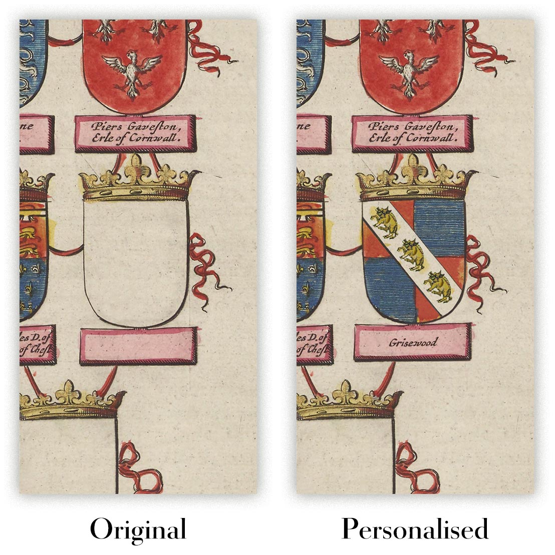
Map personalisation
If you're looking for the perfect anniversary or housewarming gift, I can personalise your map to make it truly unique. For example, I can add a short message, or highlight an important location, or add your family's coat of arms.
The options are almost infinite. Please see my map personalisation page for some wonderful examples of what's possible.
To order a personalised map, select "personalise your map" before adding it to your basket.
Get in touch if you're looking for more complex customisations and personalisations.
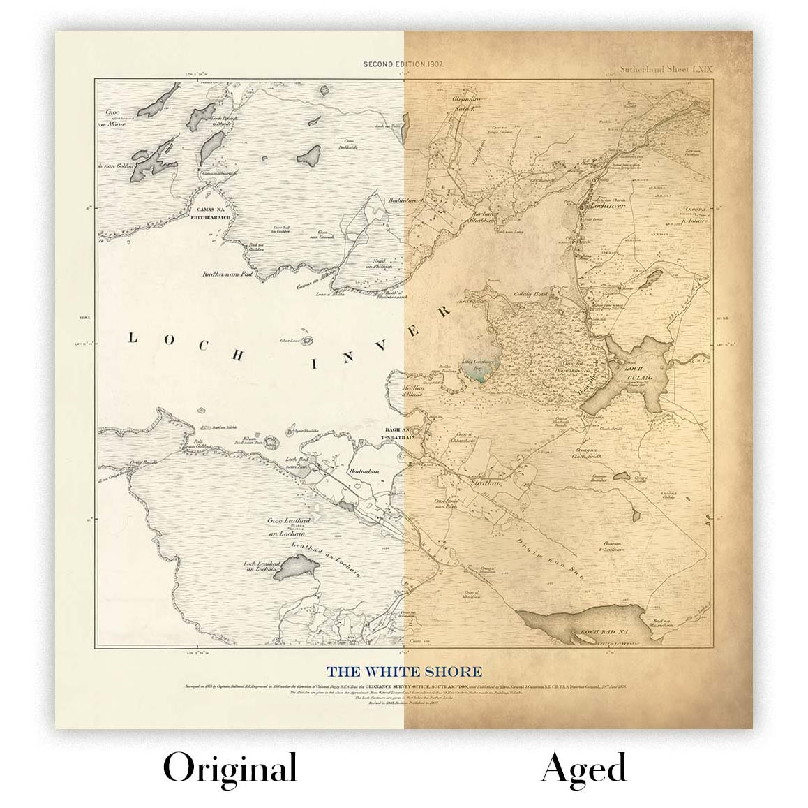
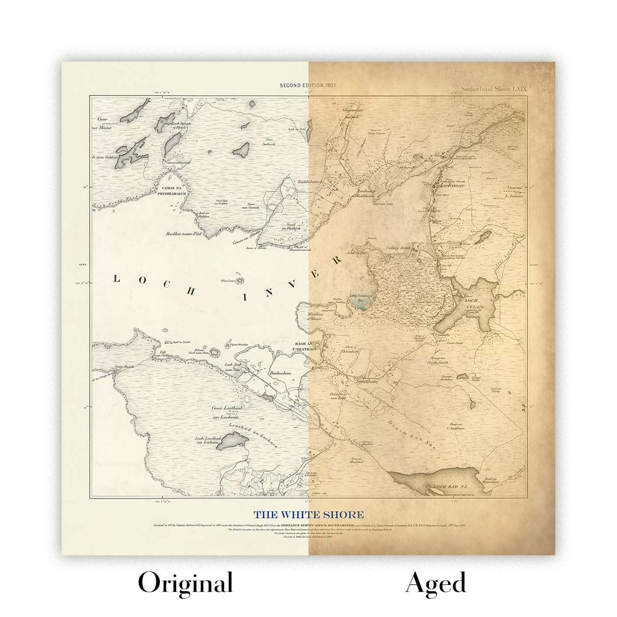
Map ageing
I have been asked hundreds of times over the years by customers if they could buy a map that looks even older.
Well, now you can, by selecting Aged before you add a map to your basket.
All the product photos you see on this page show the map in its Original form. This is what the map looks like today.
If you select Aged, I will age your map by hand, using a special and unique process developed through years of studying old maps, talking to researchers to understand the chemistry of aging paper, and of course... lots of practice!
If you're unsure, stick to the Original colour of the map. If you want something a bit darker and older looking, go for Aged.
If you are not happy with your order for any reason, contact me and I'll get it fixed ASAP, free of charge. Please see my returns and refund policy for more information.
I am very confident you will like your restored map or art print. I have been doing this since 1984. I'm a 5-star Etsy seller. I have sold tens of thousands of maps and art prints and have over 5,000 real 5-star reviews. My work has been featured in interior design magazines, on the BBC, and on the walls of dozens of 5-star hotels.
I use a unique process to restore maps and artwork that is massively time consuming and labour intensive. Hunting down the original maps and illustrations can take months. I use state of the art and eye-wateringly expensive technology to scan and restore them. As a result, I guarantee my maps and art prints are a cut above the rest. I stand by my products and will always make sure you're 100% happy with what you receive.
Almost all of my maps and art prints look amazing at large sizes (200cm, 6.5ft+) and I can frame and deliver them to you as well, via special oversized courier. Contact me to discuss your specific needs.
Or try searching for something!


