


Upside-Down World Map, 2026: South-up, Pseudo-Mercator, Colour Coded Countries
20% de réduction sur 2 — 33% de réduction sur 3
Ajoutez n'importe quel deux articles éligibles à votre panier pour recevoir 20% de réduction. Ajoutez un troisième et il sera offert (équivalent à 33% de réduction lors de l'achat de trois).
Aucun code nécessaire — l'offre s'applique automatiquement au moment du paiement.
Valide sur toutes les cartes standard et les impressions d'art. Vous pouvez mélanger et assortir n'importe quel design.
Si vous souhaitez expédier des articles à plusieurs adresses, veuillez nous contacter avant de passer votre commande.
Les commandes personnalisées et sur mesure sont exclues.
Contactez-nous si vous avez des questions
 Conçu à Londres Fabriqué en the USA
Conçu à Londres • Fabriqué en the USA
Conçu à Londres Fabriqué en the USA
Conçu à Londres • Fabriqué en the USA

Une carte moderne de 2026, imprimée sur des matériaux haut de gamme. Lire l’histoire de cette carte
Choose your size
Choose your finish


(Plus d’infos)
Message cadeau & finition personnalisée

Si vous souhaitez ajouter un message cadeau, ou une finition (puzzle, panneau en aluminium, etc.) qui n'est pas disponible ici, veuillez le demander dans la "note de commande" lors de votre passage à la caisse.
Chaque commande est fabriquée sur mesure, donc si vous avez besoin d'ajuster légèrement la taille, ou d'imprimer sur un matériau inhabituel, faites-le nous savoir. Nous avons réalisé des milliers de commandes personnalisées au fil des ans, donc il n'y a (presque) rien que nous ne puissions gérer.
Vous pouvez également nous contacter avant de passer votre commande, si vous le souhaitez !

- Fabriqué localement. Livraison sûre
- Sans droits ni frais cachés
- Besoin d’aide ? Appelez-nous ou message WhatsApp
Own a piece of history
8,000+ five-star reviews


Upside Down World Map by The Unique Maps Co. (2026) overturns the familiar north-up convention to give the Southern Hemisphere pride of...
Continuer la lectureUpside Down World Map by The Unique Maps Co. (2026) overturns the familiar north-up convention to give the Southern Hemisphere pride of place, while preserving the legibility of a modern political chart. Rendered in a pseudo-Mercator projection, it keeps the straight parallels and meridians—and the expected high-latitude exaggerations—that make global outlines instantly recognizable. A contemporary palette assigns distinct hues to every country, with lucid, unfussy typography and soft ocean tones that let information breathe. A discreet grid overlays the seas, offering bearings without clutter. The result is a deft balancing act: a map that looks comfortingly orthodox at first glance, yet quietly rewires perspective, inviting viewers to interrogate the cultural habits that have long defined which parts of the world appear “on top.”
By literally flipping the frame, this composition joins a lineage of south-up cartography that stretches from medieval and Islamic traditions to late-20th-century corrective maps, while acknowledging how the north-up standard crystallized with European navigation and Mercator’s 16th‑century projection. Its use of a pseudo-Mercator—ubiquitous in contemporary web mapping—anchors the experiment in visual familiarity even as the orientation challenges bias. The labeled oceans and seas, plotted over a fine graticule, signal analytical seriousness rather than novelty for novelty’s sake. In doing so, the map reframes geography as a set of conscious choices—projection, centering, and “upness”—not immutable truths, and it encourages a more plural understanding of the world’s political imagination.
Visually, the inversion lends fresh prominence to regions often relegated to cartographic margins. Australia and New Zealand rise to commanding positions near the upper sweep of the Pacific, their coastlines crisply delineated against the Indian and Southern Oceans. South America asserts a graceful verticality above a recontextualized North America, with Brazil’s vast interior reading as a crown rather than a footnote. Across the lower edge, Antarctica forms a luminous, continuous counterweight, a glacial baseline anchoring the composition. Island chains thread the central waters: Hawaii steps across the mid-Pacific like a hinge between hemispheres, while the Indonesian archipelago and the scattered jewels of the Indian Ocean gain renewed coherence in this orientation. Clear labels for the Atlantic, Pacific, Indian, Arctic, and Southern Oceans, along with key seas, tether the eye amid the delightful disorientation.
As a political map, its color coding and clean labeling render complex sovereignty legible at a glance, yet the flipped vantage subtly reorders cognitive hierarchies. The Russian Federation and Canada still sprawl with projection-amplified breadth, a reminder of pseudo-Mercator’s polar magnification, but they now occupy the visual “down” space, challenging instinctive associations between size, elevation, and importance. China’s continental heft and the United States’ familiar outline are instantly readable, but re-situated beneath newly eminent southern lands. Europe appears as an elegant promontory below a lofted Africa, while longitudinal spacing across the grid clarifies transoceanic relationships. This interplay of distortion, order, and inversion makes the map a primer on how design choices shape geopolitical perception.
More than décor, this is a conversation engine—an elegant instrument for classrooms, studios, and boardrooms where perspective matters. It foregrounds the arbitrariness of “up” and “down,” inviting debates about educational norms, navigation history, and the cartographic echoes of power. The subtle grid and meticulous toponyms temper the provocation with scholarly poise, while the contemporary palette gives modern polish to a centuries-old argument. Viewers find themselves mentally rotating coastlines, recalibrating distances, and reconsidering center and margin, especially across the Pacific where island nations gain narrative gravity. In the end, Upside Down World Map is both a faithful political atlas and a quiet manifesto: a beautifully reasoned case for looking at the world, quite literally, from another angle.
Countries and regions on this map
- Australia
- Brazil
- Canada
- China
- Russian Federation
- United States
- Antarctica
- Various islands in the Pacific and Indian Oceans (e.g., New Zealand, Hawaii, etc.)
Notable Features & Landmarks
- Continent Orientation: The world is flipped upside down, significantly altering conventional perceptions of continent locations.
- Color Coding: Each country is distinctly colored, facilitating clear identification.
- Labeling: Countries are labeled clearly, enhancing ease of understanding.
- Ocean and Sea Names: Key oceans and seas are marked, reinforcing geographical context.
- Grid Overlay: A subtle grid is present, adding functional elements for navigation.
Historical and design context
- Year of Creation: 2026
- Mapmaker/Publisher: The Unique Maps Co.
- Theme: A detailed political map that challenges traditional geographic perspectives by flipping the world upside down.
- Projection: Utilizes a pseudo-Mercator projection, maintaining the proportions and distortions typical of traditional world maps.
- Design: Contemporary color palette with clear country delineation and labeling; soft ocean tones and a subtle grid enhance cartographic credibility.
- Geographic Significance: Highlights the Southern Hemisphere by positioning it at the top, contrasting with conventional Eurocentric north-up maps and encouraging reconsideration of assumptions.
- Visual Impact: The inversion makes regions such as South America and Australia prominent; Antarctica features prominently across the lower edge.
- Discussion Potential: Serves as a statement piece, provoking dialogue on cultural biases in mapping and the arbitrary nature of “up” and “down” orientations.
Please double check the images to make sure that a specific town or place is shown on this map. You can also get in touch and ask us to check the map for you.
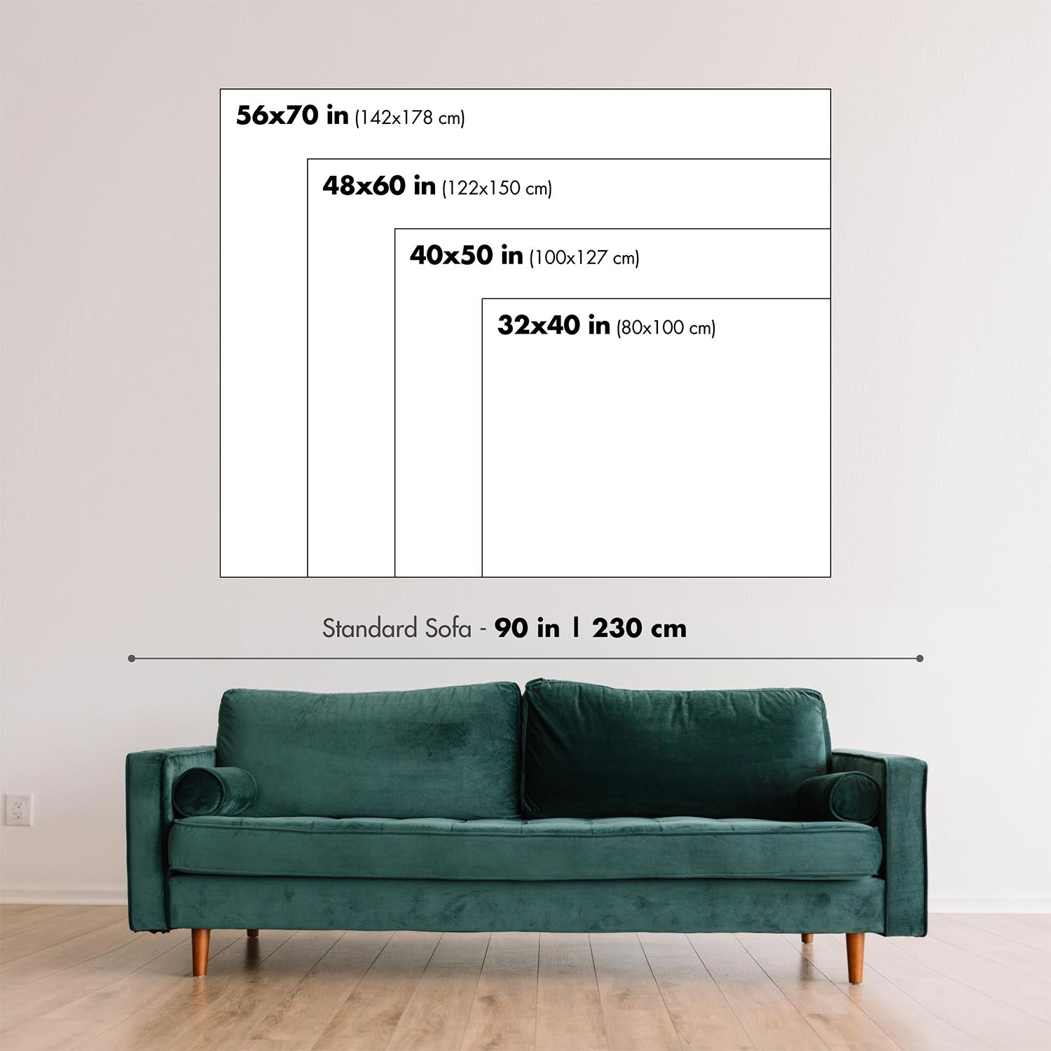
This map looks great at every size, but I always recommend going for a larger size if you have space. That way you can easily make out all of the details.
This map looks amazing at sizes all the way up to 100in (250cm). If you are looking for a larger map, please get in touch.
The model in the listing images is holding the 18x24in (45x60cm) version of this map.
The fifth listing image shows an example of my map personalisation service.
If you’re looking for something slightly different, check out my collection of the best old maps to see if something else catches your eye.
Please contact me to check if a certain location, landmark or feature is shown on this map.
This would make a wonderful birthday, Christmas, Father's Day, work leaving, anniversary or housewarming gift for someone from the areas covered by this map.
This map is available as a giclée print on acid free archival matte paper, or you can buy it framed. The frame is a nice, simple black frame that suits most aesthetics. Please get in touch if you'd like a different frame colour or material. My frames are glazed with super-clear museum-grade acrylic (perspex/acrylite), which is significantly less reflective than glass, safer, and will always arrive in perfect condition.
This map is also available as a float framed canvas, sometimes known as a shadow gap framed canvas or canvas floater. The map is printed on artist's cotton canvas and then stretched over a handmade box frame. We then "float" the canvas inside a wooden frame, which is available in a range of colours (black, dark brown, oak, antique gold and white). This is a wonderful way to present a map without glazing in front. See some examples of float framed canvas maps and explore the differences between my different finishes.
For something truly unique, this map is also available in "Unique 3D", our trademarked process that dramatically transforms the map so that it has a wonderful sense of depth. We combine the original map with detailed topography and elevation data, so that mountains and the terrain really "pop". For more info and examples of 3D maps, check my Unique 3D page.
Upside Down World Map by The Unique Maps Co. (2026) overturns the familiar north-up convention to give the Southern Hemisphere pride of place, while preserving the legibility of a modern political chart. Rendered in a pseudo-Mercator projection, it keeps the straight parallels and meridians—and the expected high-latitude exaggerations—that make global outlines instantly recognizable. A contemporary palette assigns distinct hues to every country, with lucid, unfussy typography and soft ocean tones that let information breathe. A discreet grid overlays the seas, offering bearings without clutter. The result is a deft balancing act: a map that looks comfortingly orthodox at first glance, yet quietly rewires perspective, inviting viewers to interrogate the cultural habits that have long defined which parts of the world appear “on top.”
By literally flipping the frame, this composition joins a lineage of south-up cartography that stretches from medieval and Islamic traditions to late-20th-century corrective maps, while acknowledging how the north-up standard crystallized with European navigation and Mercator’s 16th‑century projection. Its use of a pseudo-Mercator—ubiquitous in contemporary web mapping—anchors the experiment in visual familiarity even as the orientation challenges bias. The labeled oceans and seas, plotted over a fine graticule, signal analytical seriousness rather than novelty for novelty’s sake. In doing so, the map reframes geography as a set of conscious choices—projection, centering, and “upness”—not immutable truths, and it encourages a more plural understanding of the world’s political imagination.
Visually, the inversion lends fresh prominence to regions often relegated to cartographic margins. Australia and New Zealand rise to commanding positions near the upper sweep of the Pacific, their coastlines crisply delineated against the Indian and Southern Oceans. South America asserts a graceful verticality above a recontextualized North America, with Brazil’s vast interior reading as a crown rather than a footnote. Across the lower edge, Antarctica forms a luminous, continuous counterweight, a glacial baseline anchoring the composition. Island chains thread the central waters: Hawaii steps across the mid-Pacific like a hinge between hemispheres, while the Indonesian archipelago and the scattered jewels of the Indian Ocean gain renewed coherence in this orientation. Clear labels for the Atlantic, Pacific, Indian, Arctic, and Southern Oceans, along with key seas, tether the eye amid the delightful disorientation.
As a political map, its color coding and clean labeling render complex sovereignty legible at a glance, yet the flipped vantage subtly reorders cognitive hierarchies. The Russian Federation and Canada still sprawl with projection-amplified breadth, a reminder of pseudo-Mercator’s polar magnification, but they now occupy the visual “down” space, challenging instinctive associations between size, elevation, and importance. China’s continental heft and the United States’ familiar outline are instantly readable, but re-situated beneath newly eminent southern lands. Europe appears as an elegant promontory below a lofted Africa, while longitudinal spacing across the grid clarifies transoceanic relationships. This interplay of distortion, order, and inversion makes the map a primer on how design choices shape geopolitical perception.
More than décor, this is a conversation engine—an elegant instrument for classrooms, studios, and boardrooms where perspective matters. It foregrounds the arbitrariness of “up” and “down,” inviting debates about educational norms, navigation history, and the cartographic echoes of power. The subtle grid and meticulous toponyms temper the provocation with scholarly poise, while the contemporary palette gives modern polish to a centuries-old argument. Viewers find themselves mentally rotating coastlines, recalibrating distances, and reconsidering center and margin, especially across the Pacific where island nations gain narrative gravity. In the end, Upside Down World Map is both a faithful political atlas and a quiet manifesto: a beautifully reasoned case for looking at the world, quite literally, from another angle.
Countries and regions on this map
- Australia
- Brazil
- Canada
- China
- Russian Federation
- United States
- Antarctica
- Various islands in the Pacific and Indian Oceans (e.g., New Zealand, Hawaii, etc.)
Notable Features & Landmarks
- Continent Orientation: The world is flipped upside down, significantly altering conventional perceptions of continent locations.
- Color Coding: Each country is distinctly colored, facilitating clear identification.
- Labeling: Countries are labeled clearly, enhancing ease of understanding.
- Ocean and Sea Names: Key oceans and seas are marked, reinforcing geographical context.
- Grid Overlay: A subtle grid is present, adding functional elements for navigation.
Historical and design context
- Year of Creation: 2026
- Mapmaker/Publisher: The Unique Maps Co.
- Theme: A detailed political map that challenges traditional geographic perspectives by flipping the world upside down.
- Projection: Utilizes a pseudo-Mercator projection, maintaining the proportions and distortions typical of traditional world maps.
- Design: Contemporary color palette with clear country delineation and labeling; soft ocean tones and a subtle grid enhance cartographic credibility.
- Geographic Significance: Highlights the Southern Hemisphere by positioning it at the top, contrasting with conventional Eurocentric north-up maps and encouraging reconsideration of assumptions.
- Visual Impact: The inversion makes regions such as South America and Australia prominent; Antarctica features prominently across the lower edge.
- Discussion Potential: Serves as a statement piece, provoking dialogue on cultural biases in mapping and the arbitrary nature of “up” and “down” orientations.
Please double check the images to make sure that a specific town or place is shown on this map. You can also get in touch and ask us to check the map for you.
This map looks great at every size, but I always recommend going for a larger size if you have space. That way you can easily make out all of the details.
This map looks amazing at sizes all the way up to 100in (250cm). If you are looking for a larger map, please get in touch.
The model in the listing images is holding the 18x24in (45x60cm) version of this map.
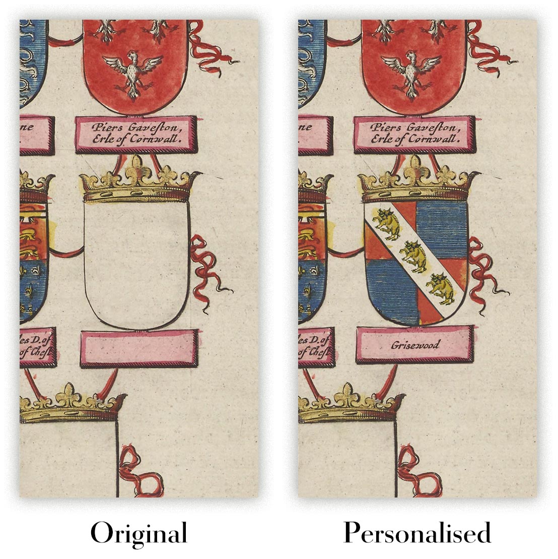
The fifth listing image shows an example of my map personalisation service.
If you’re looking for something slightly different, check out my collection of the best old maps to see if something else catches your eye.
Please contact me to check if a certain location, landmark or feature is shown on this map.
This would make a wonderful birthday, Christmas, Father's Day, work leaving, anniversary or housewarming gift for someone from the areas covered by this map.
This map is available as a giclée print on acid free archival matte paper, or you can buy it framed. The frame is a nice, simple black frame that suits most aesthetics. Please get in touch if you'd like a different frame colour or material. My frames are glazed with super-clear museum-grade acrylic (perspex/acrylite), which is significantly less reflective than glass, safer, and will always arrive in perfect condition.
This map is also available as a float framed canvas, sometimes known as a shadow gap framed canvas or canvas floater. The map is printed on artist's cotton canvas and then stretched over a handmade box frame. We then "float" the canvas inside a wooden frame, which is available in a range of colours (black, dark brown, oak, antique gold and white). This is a wonderful way to present a map without glazing in front. See some examples of float framed canvas maps and explore the differences between my different finishes.
For something truly unique, this map is also available in "Unique 3D", our trademarked process that dramatically transforms the map so that it has a wonderful sense of depth. We combine the original map with detailed topography and elevation data, so that mountains and the terrain really "pop". For more info and examples of 3D maps, check my Unique 3D page.
Many of our maps and art prints are chosen as thoughtful gifts for homes, offices, studies and meaningful places.
Choose a framed option for the easiest ready-to-hang gift, or choose an unframed print if the recipient may prefer to select their own frame.
We make orders locally in 23 countries around the world, so gifts can often be produced close to the recipient. This helps them arrive faster, travel more safely, and avoid customs or import duty surprises.
- We can deliver directly to the recipient
- Framed pieces arrive ready to hang
- Unframed prints are carefully packed in a strong protective tube
- Almost every order is made locally, for faster, safer gifting
- 90-day returns give the recipient time to decide
If you are not sure what to choose, please contact us. We can help you pick the right map, size, finish or delivery option.
Pour la plupart des commandes, le délai de livraison est d'environ 3 jours ouvrables. Les produits personnalisés et sur mesure prennent plus de temps, car je dois faire la personnalisation et vous l'envoyer pour approbation, ce qui prend généralement 1 ou 2 jours.
Veuillez noter que les grandes commandes encadrées prennent généralement plus de temps à réaliser et à livrer.
Si vous avez besoin que votre commande arrive à une date précise, veuillez me contacter avant de passer votre commande afin que nous puissions trouver le meilleur moyen de nous assurer que vous receviez votre commande à temps.
J'imprime et encadre des cartes et des œuvres d'art dans 23 pays à travers le monde. Cela signifie que votre commande sera réalisée localement, ce qui réduit le temps de livraison et garantit qu'elle ne sera pas endommagée pendant le transport. Vous ne paierez jamais de droits de douane ou d'importation, et nous mettrons moins de CO2 dans l'air.
Toutes mes cartes et impressions artistiques sont bien emballées et envoyées dans un tube robuste si non encadrées, ou entourées de mousse si encadrées.
J'essaie d'envoyer toutes les commandes dans les 1 ou 2 jours suivant la réception de votre commande, bien que certains produits (comme les masques, les mugs et les sacs fourre-tout) puissent prendre plus de temps à réaliser.
Si vous choisissez Livraison Express lors du paiement, nous donnerons la priorité à votre commande et l'enverrons par un service de messagerie de 1 jour (Fedex, DHL, UPS, Parcelforce).
La livraison le lendemain est également disponible dans certains pays (États-Unis, Royaume-Uni, Singapour, Émirats Arabes Unis), mais veuillez essayer de commander tôt dans la journée afin que nous puissions l'envoyer à temps.
Lisez mon guide complet sur la livraison et la production locale
Mon cadre standard est un cadre en bois dur noir de style galerie. Il est simple et a un aspect assez moderne. Mon cadre standard mesure environ 20 mm (0,8 po) de large.
J'utilise de l'acrylique super clair (perspex/acrylite) pour le verre du cadre. C'est plus léger et plus sûr que le verre - et cela a meilleur aspect, car la réflexivité est plus faible.
Six couleurs de cadre standard sont disponibles gratuitement (noir, marron foncé, gris foncé, chêne, blanc et or antique). Des encadrements et montages/matelassages personnalisés sont disponibles si vous recherchez autre chose.
La plupart des cartes, œuvres d'art et illustrations sont également disponibles sous forme de toile encadrée. Nous utilisons une toile en coton mate (non brillante), que nous tendons sur un cadre en bois de boîte provenant de sources durables, puis nous 'flottions' la pièce à l'intérieur d'un cadre en bois. Le résultat final est assez beau, et il n'y a pas de vitrage qui gêne.
Tous les cadres sont fournis "prêts à accrocher", avec soit une corde, soit des supports à l'arrière. Les très grands cadres auront des plaques de suspension lourdes et/ou une latte de montage. Si vous avez des questions, veuillez nous contacter.
Voir quelques exemples de mes cartes encadrées et de cartes en toile encadrées.
Alternativement, je peux également fournir de vieilles cartes et œuvres d'art sur toile, sur panneau en mousse, en coton et d'autres matériaux.
Si vous souhaitez encadrer votre carte ou œuvre d'art vous-même, veuillez lire d'abord mon guide des tailles.
Mes cartes sont des reproductions de cartes originales de très haute qualité.
Je recherche des cartes originales et rares auprès de bibliothèques, de maisons de ventes aux enchères et de collections privées du monde entier, je les restaure dans mon atelier de Londres, puis j'utilise des encres et des imprimantes giclées spécialisées pour créer de magnifiques cartes encore plus belles que l'originale.
Mes cartes sont imprimées sur du papier d’archives mat (non brillant) sans acide qui semble de très haute qualité et ressemble presque à une carte. En termes techniques, le grammage/épaisseur du papier est de 10 mil/200 g/m². C'est parfait pour l'encadrement.
J’imprime avec des encres pigmentaires Epson ultrachrome giclée UV résistantes à la décoloration – certaines des meilleures encres que vous puissiez trouver.
je peux aussi faire cartes sur toile, chiffon en coton et autres matériaux exotiques.
En savoir plus sur Unique Maps Co..
Personnalisation de la carte
Si vous recherchez le cadeau parfait pour un anniversaire ou une pendaison de crémaillère, je peux personnaliser votre carte pour la rendre vraiment unique. Par exemple, je peux ajouter un court message, mettre en évidence un lieu important ou ajouter les armoiries de votre famille.
Les options sont presque infinies. S'il vous plaît voir mon page de personnalisation de la carte pour quelques merveilleux exemples de ce qui est possible.
Pour commander une carte personnalisée, sélectionnez « personnaliser votre carte » avant de l'ajouter à votre panier.
Entrer en contact si vous recherchez des personnalisations et des personnalisations plus complexes.
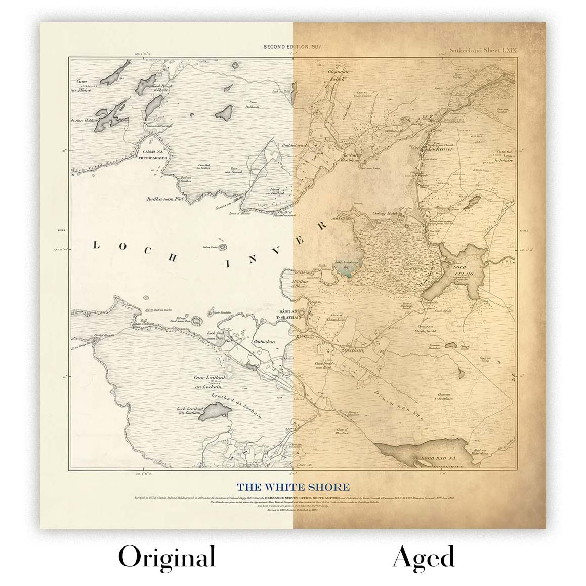
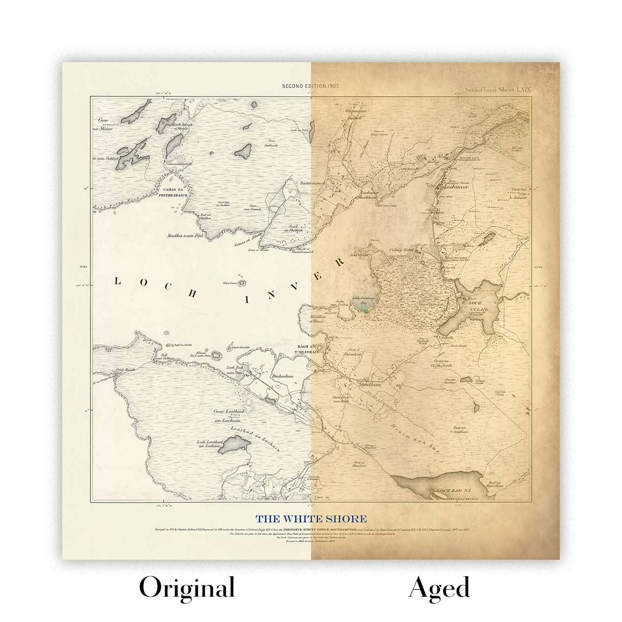
Vieillissement de la carte
Au fil des ans, des clients m'ont demandé des centaines de fois s'ils pouvaient acheter une carte qui semble uniforme. plus vieux.
Eh bien, vous pouvez désormais le faire en sélectionnant Aged avant d'ajouter une carte à votre panier.
Toutes les photos de produits que vous voyez sur cette page montrent la carte dans sa forme originale. Voilà à quoi ressemble la carte aujourd'hui.
Si vous sélectionnez Vieilli, je vieillirai votre carte à la main, en utilisant un processus spécial et unique développé au cours d'années d'étude de cartes anciennes, de discussions avec des chercheurs pour comprendre la chimie du vieillissement du papier, et bien sûr... beaucoup de pratique !
Si vous n'êtes pas sûr, respectez la couleur originale de la carte. Si vous voulez quelque chose d'un peu plus sombre et plus vieux à la recherche, optez pour Aged.
Si vous n'êtes pas satisfait de votre commande pour une raison quelconque, contactez-moi pour un remboursement sans conditions. Veuillez consulter notre politique de retours et de remboursements pour plus d'informations.
Je suis très confiant que vous aimerez votre carte restaurée ou votre impression artistique. Je fais cela depuis 1984. Je suis un vendeur Etsy 5 étoiles. J'ai vendu des dizaines de milliers de cartes et d'impressions artistiques et j'ai plus de 5 000 vrais avis 5 étoiles.
J'utilise un processus unique pour restaurer des cartes et des œuvres d'art qui est extrêmement chronophage et exigeant en main-d'œuvre. Trouver les cartes et illustrations originales peut prendre des mois. J'utilise une technologie de pointe et incroyablement coûteuse pour les numériser et les restaurer. En conséquence, je garantis que mes cartes et impressions artistiques sont d'une qualité supérieure - c'est pourquoi je peux offrir un remboursement sans conditions.
Presque toutes mes cartes et impressions artistiques ont l'air incroyables en grandes tailles (200 cm, 6,5 pieds+) et je peux également les encadrer et vous les livrer, via un transporteur spécial surdimensionné. Contactez-moi pour discuter de vos besoins spécifiques.
Or try searching for something!


